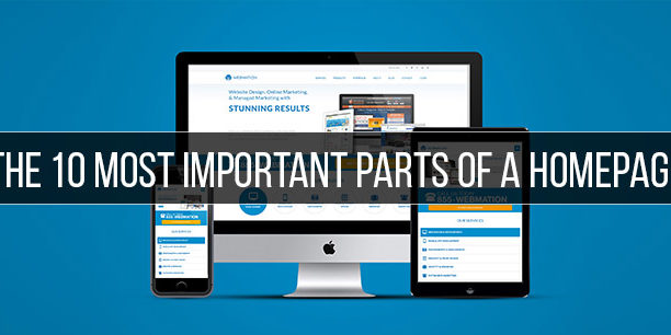
The 10 Most Important Parts Of a Homepage
Your homepage: the front window of your business where you get to put what you do on display. The perfect setting to put your best foot forward. The first, and possibly only, impression on a potential customer or client. With so much at stake, you want to be as prepared as possible by leaving no detail unattended to. That’s what makes these the 10 most important parts of a homepage.
1) Headline
Have a single sentence clearly stating what your site has to offer. Get your viewers attention with something that has a little personality to it and leaves a unique impression. People are more likely to read this than your actual copy, so make it count.
2) Sub-Headline
This is your chance to further describe whatever it was that you previously stated in your headline. Elaborate a little more to maintain your viewer’s interest and prompt them to continue exploring.
3) Primary CTA’s
Guide your audience with a well positioned Calls-to-Action above the fold. These CTA’s should take the user to your main objective. If you’re an E-Commerce site take them to your ‘Shop’ page. If you’re selling a service, take them to the page with your differentiating factor.
4) Visual Support
Most people are visual learners, meaning seeing truly is believing. Beautiful, professional photography will be the best way to show off your products, service, or team. Try to restrict stock photography, though there is some worth using, and be sure to show your personality.
5) Benefits
What sets your company or product apart? A few key points highlighted on the homepage make for quick associations the viewer will hold with them as they peruse the rest of your beautiful site.
6) Navigation
Speaking of perusing, make sure your visitors have a clear navigation to guide them. Nobody likes hanging out somewhere where they keep getting lost with no clear way home. Keep it simple, easy to find, and readily available. If possible, include a search bar so if they want to find something specific, they can.
7) Logo
Like we said earlier, most people are visual. A logo gives people something unique they can instantly associate with your company, and the pleasant experience they (hopefully) had while visiting your site. Even if it was brief. Be sure to keep your branding consistent as well to further encourage association.
8) Contact Information
Make it easy for people to get in touch with your company. If you have a brick and mortar location, be sure to include that.
9) Social Media Logos
Give the visitor a way to connect with the company and see it’s personality a little more. Only feature buttons for social platforms that you’re active on, there’s nothing less engaging than a dead social media outlet.
10) Actionable Elements
Videos, downloads, blog posts, animations and other visual elements that involve user engagement will encourage a longer stay and more exploration.
A good homepage won’t look the same for every company in every field, and that’s a great thing. Just be sure you get you point across and give people an ample opportunity to know what you’re about, how to engage with you, and how to buy your product or service if they so choose. If you’re able to do all of that without someone leaving your homepage than I’d say you’ve done a good job.


